In 2023, I led a six-month initiative to create a scalable email design system to address inefficiencies in email production and inconsistencies in branding. My role encompassed research, design, and cross-functional collaboration, resulting in a centralized system built in Figma and optimized with the Emailify plugin for seamless integration with Salesforce Marketing Cloud.
The fragmented email process led to slow production times, inconsistent visuals, and suboptimal performance. By establishing a robust design system aligned with industry best practices, I aimed to improve efficiency, ensure brand consistency, and enhance email performance metrics.


The challenge
Stuller’s email marketing process was fragmented, leading to several challenges:
Inconsistent Branding: Each email looked different depending on the designer or marketing specialist that created it, which diluted our brand presence.
Slow Production Times: Designers and marketers struggled to produce emails quickly due to a lack of reusable assets.
Technical Inefficiencies: Many emails failed to adhere to best practices, which impacted their deliverability and performance.
Another major challenge was technical optimization. Many emails contained inconsistent and image-heavy designs that flattened text into images, increasing the risk of emails being flagged as spam and reducing accessibility. Additionally, emails were not always ADA-compliant, and there was no centralized system for ensuring adherence to these standards.

↑ Suboptimal and inconsistent email designs, 2023
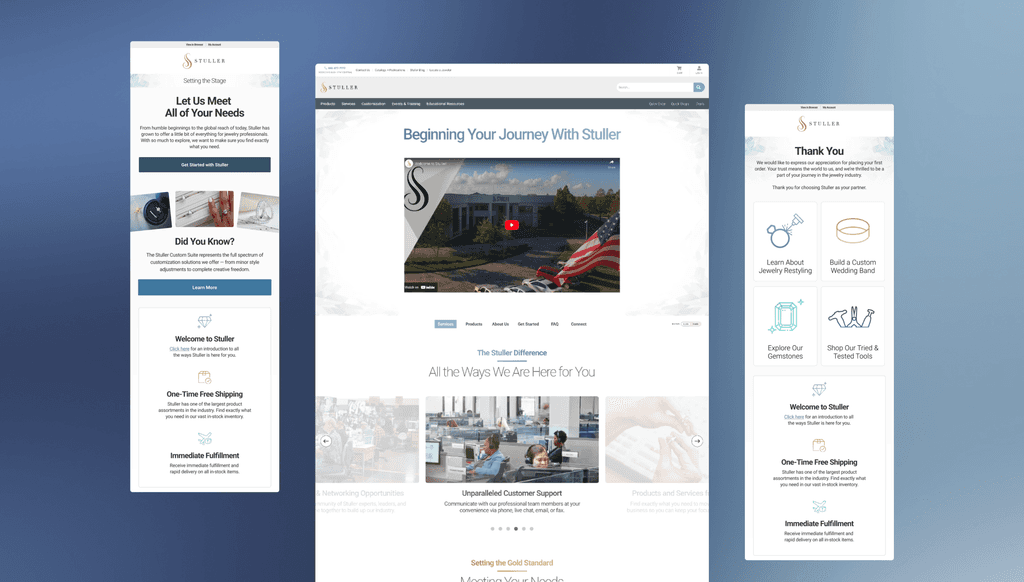
Research and analysis
To kick off the project, I analyzed email performance metrics from our Litmus account, identifying key areas for improvement such as inconsistent click-through rates and engagement patterns. I complemented this with industry research, benchmarking our emails against leading competitors to uncover opportunities for optimization. To gather direct insights, we sent out a customer feedback survey that highlighted recipient frustrations, including unclear calls to action, inconsistent design, and accessibility issues. These findings provided a clear roadmap for improvement.
I then conducted an audit of our email library, focusing on ADA compliance, technical optimization, and adherence to best practices. Issues such as inaccessible color contrasts and flattened text increased the risk of emails being flagged as spam. Coupled with survey feedback pointing to navigation difficulties on mobile, I prioritized creating a scalable solution. After testing tools like Email on Acid and Klaviyo, I selected Emailify for its seamless integration with Figma and support for HTML-optimized designs, setting the foundation for a robust email design system.

↑ Research and analysis presentation to stakeholders (confidential information redacted)
Creating the building blocks
The design system’s backbone was a robust library of components designed in Figma and optimized in Emailify. These components were modular, flexible, and optimized for accessibility. For instance, I created designs that allowed for custom backgrounds while ensuring text remained HTML-based, minimizing the risk of emails being flagged as spam. The final system was scalable, enabling teams to quickly assemble emails while maintaining visual consistency and adhering to brand standards.

↑ Core components

↑ Component variants

↑ Component hierarchy structure
The design system is grounded in user needs, brand guidelines, and email best practices. I defined three core archetypes for all email communications: Transactional, Promotional, and Campaign. Each archetype was tailored to specific business objectives and user behaviors, allowing for clarity and focus in email strategy.
For confidentiality purposes, I can only show examples of Promotional email types.


↑ New promotional email designs
Empowering contributors
I recognized that a design system is only effective when it is accessible and easy to adopt. To ensure alignment across teams, I developed a comprehensive Email Styleguide hosted in Confluence. This hub served as a single source of truth for designers, marketers, and copywriters, offering guidance on component usage, brand standards, and accessibility best practices. I also conducted presentations and workshops to onboard teams, gathering feedback to iteratively improve the system.

↑ Screenshot of styleguide from Confluence
Outcome
The email design system produced measurable improvements in both performance and efficiency:
Efficiency Gains: Email production time decreased by 40%, enabling the team to produce more emails per month while maintaining consistent branding.
Improved Metrics: Click-through rates increased by 4% due to the adoption of industry best practices and optimized designs.
Brand Consistency: All emails adhered to the company’s brand guidelines, strengthening our brand identity across touchpoints.
Stakeholders provided positive feedback, noting how the new system empowered designers and marketers to create high-quality emails independently.


↑ Before and after email designs
Next steps
Looking ahead, I plan to expand the email design system by incorporating new archetypes based on evolving business needs and customer behaviors. Regular updates to the Email Styleguide in Confluence will ensure the system remains aligned with brand standards and best practices. Additionally, I aim to gather more customer feedback through surveys and A/B testing to continuously refine and optimize the email experience for improved engagement and performance.